← Back
Medical Analysis Software
UX/UI Redesign
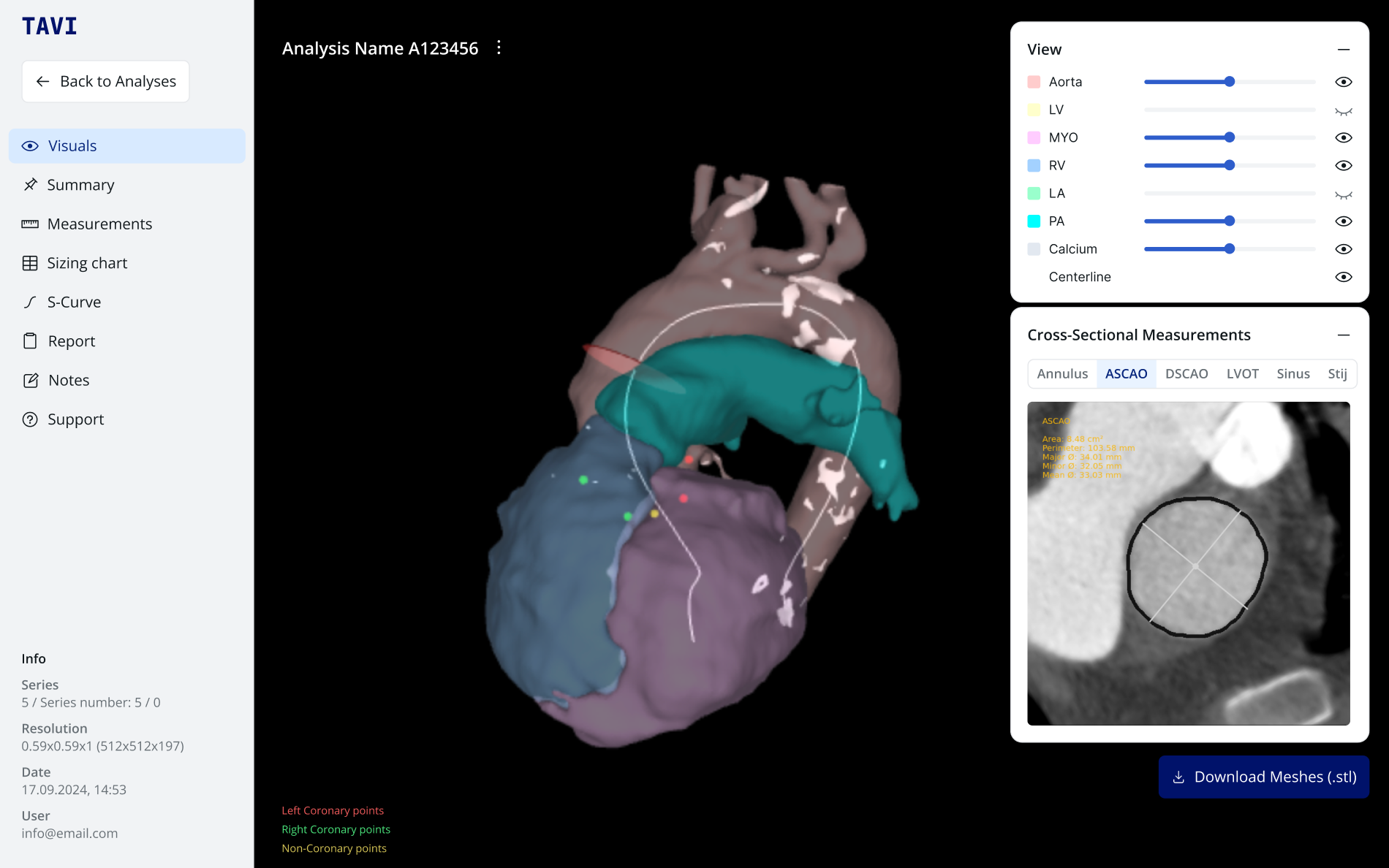
This web‑based software supports the analysis of medical imaging, report creation and intervention planning. Though technically robust, the interface was visually outdated and structurally confusing. I ran a full UX audit, optimized core flows and rebuilt the UI as a modern, intuitive system – complete with a scalable design system for future growth.
Starting point
The client’s legacy application had grown over years without a unified design approach. Though rich in features, it lacked clear guidance, consistent visuals, and a cohesive structure. Doctors often struggled to move from image analysis to report creation, and the interface felt cluttered and steeped in jargon. The client wanted a fresh interface that did justice to their AI technology and supported complex medical workflows.
Challenges & Opportunities
Reworking a mission‑critical medical application on a tight budget and timeline was a big challenge. We couldn’t run full user research, so we leaned on expert reviews and industry best practices. At the same time, the client continued developing new features in parallel, so our designs had to stay flexible. The medical content itself is highly complex, demanding extremely precise user guidance. Yet these constraints also gave us a chance to prove how expert-driven UX can transform even the most technical applications into intuitive, future-proof solutions.
My Approach
As the sole UX/UI designer on the project, I was responsible for the complete redesign – from analysis to final design system. I worked closely with the client and development team to ensure every step was aligned with technical feasibility and medical accuracy.
- Kick‑off & Expert ReviewI led a workshop with all stakeholders and performed an in‑depth expert UX audit. We assessed interface consistency, workflow bottlenecks and visual shortcomings to set our priorities.
- Flow RedesignBased on audit findings, I mapped out critical user journeys and optimized each step for clarity and efficiency.
- Wireframing & Prototype IterationsI sketched low‑fidelity wireframes to test new layouts quickly. These evolved into clickable prototypes in Figma, which we reviewed weekly with stakeholders and adjusted based on feedback.
- Visual UI & Design SystemI crafted a clean, reduced interface style: spacious layouts, clear typography and color cues tied to different workflow stages. Using Radix as a foundation, I built a scalable component library and documented guidelines for spacing, states and accessibility.
- Developer Handoff & DocumentationAll modules, flows and components were annotated in Confluence and handed off with detailed specs. I collaborated closely with developers to ensure pixel‑perfect implementation and smooth integration into the existing codebase.
Solution & Outcome
The result is a streamlined, web-based software with an intuitive user experience and a strong visual identity. The modular system supports ongoing feature development and allows the product to grow without losing clarity or coherence. Key workflows are now easier to navigate, and the design reflects the high standard of the underlying AI technology.
The design system not only increased consistency but also significantly improved the communication between design and development – saving time and reducing misinterpretation during implementation.
Reflection & Learnings
Working without formal user research taught me the strength of expert reviews and best‑practice frameworks. Balancing ongoing feature development with a full UI overhaul deepened my skills in iterative design and stakeholder management. Most rewarding was seeing a highly technical product become more approachable and efficient – proof that thoughtful UX can drive real impact in critical tools.
This case study has been anonymized to respect confidentiality agreements.
I’d be happy to walk you through the final product in a personal demo.
← Back
Medical Analysis Software
UX/UI Redesign
This web‑based software supports the analysis of medical imaging, report creation and intervention planning. Though technically robust, the interface was visually outdated and structurally confusing. I ran a full UX audit, optimized core flows and rebuilt the UI as a modern, intuitive system – complete with a scalable design system for future growth.
Starting point
The client’s legacy application had grown over years without a unified design approach. Though rich in features, it lacked clear guidance, consistent visuals, and a cohesive structure. Doctors often struggled to move from image analysis to report creation, and the interface felt cluttered and steeped in jargon. The client wanted a fresh interface that did justice to their AI technology and supported complex medical workflows.
Challenges & Opportunities
Reworking a mission‑critical medical application on a tight budget and timeline was a big challenge. We couldn’t run full user research, so we leaned on expert reviews and industry best practices. At the same time, the client continued developing new features in parallel, so our designs had to stay flexible. The medical content itself is highly complex, demanding extremely precise user guidance. Yet these constraints also gave us a chance to prove how expert-driven UX can transform even the most technical applications into intuitive, future-proof solutions.
My Approach
As the sole UX/UI designer on the project, I was responsible for the complete redesign – from analysis to final design system. I worked closely with the client and development team to ensure every step was aligned with technical feasibility and medical accuracy.
- Kick‑off & Expert ReviewI led a workshop with all stakeholders and performed an in‑depth expert UX audit. We assessed interface consistency, workflow bottlenecks and visual shortcomings to set our priorities.
- Flow RedesignBased on audit findings, I mapped out critical user journeys and optimized each step for clarity and efficiency.
- Wireframing & Prototype IterationsI sketched low‑fidelity wireframes to test new layouts quickly. These evolved into clickable prototypes in Figma, which we reviewed weekly with stakeholders and adjusted based on feedback.
- Visual UI & Design SystemI crafted a clean, reduced interface style: spacious layouts, clear typography and color cues tied to different workflow stages. Using Radix as a foundation, I built a scalable component library and documented guidelines for spacing, states and accessibility.
- Developer Handoff & DocumentationAll modules, flows and components were annotated in Confluence and handed off with detailed specs. I collaborated closely with developers to ensure pixel‑perfect implementation and smooth integration into the existing codebase.
Solution & Outcome
The result is a streamlined, web-based software with an intuitive user experience and a strong visual identity. The modular system supports ongoing feature development and allows the product to grow without losing clarity or coherence. Key workflows are now easier to navigate, and the design reflects the high standard of the underlying AI technology.
The design system not only increased consistency but also significantly improved the communication between design and development – saving time and reducing misinterpretation during implementation.
Reflection & Learnings
Working without formal user research taught me the strength of expert reviews and best‑practice frameworks. Balancing ongoing feature development with a full UI overhaul deepened my skills in iterative design and stakeholder management. Most rewarding was seeing a highly technical product become more approachable and efficient – proof that thoughtful UX can drive real impact in critical tools.
This case study has been anonymized to respect confidentiality agreements.
I’d be happy to walk you through the final product in a personal demo.
← Back
Medical Analysis SoftwareUX/UI Redesign
This web‑based software supports the analysis of medical imaging, report creation and intervention planning. Though technically robust, the interface was visually outdated and structurally confusing. I ran a full UX audit, optimized core flows and rebuilt the UI as a modern, intuitive system – complete with a scalable design system for future growth.
Starting point
The client’s legacy application had grown over years without a unified design approach. Though rich in features, it lacked clear guidance, consistent visuals, and a cohesive structure. Doctors often struggled to move from image analysis to report creation, and the interface felt cluttered and steeped in jargon. The client wanted a fresh interface that did justice to their AI technology and supported complex medical workflows.
Challenges & Opportunities
Reworking a mission‑critical medical application on a tight budget and timeline was a big challenge. We couldn’t run full user research, so we leaned on expert reviews and industry best practices. At the same time, the client continued developing new features in parallel, so our designs had to stay flexible. The medical content itself is highly complex, demanding extremely precise user guidance. Yet these constraints also gave us a chance to prove how expert-driven UX can transform even the most technical applications into intuitive, future-proof solutions.
My Approach
As the sole UX/UI designer on the project, I was responsible for the complete redesign – from analysis to final design system. I worked closely with the client and development team to ensure every step was aligned with technical feasibility and medical accuracy.
- Kick‑off & Expert ReviewI led a workshop with all stakeholders and performed an in‑depth expert UX audit. We assessed interface consistency, workflow bottlenecks and visual shortcomings to set our priorities.
- Flow RedesignBased on audit findings, I mapped out critical user journeys and optimized each step for clarity and efficiency.
- Wireframing & Prototype IterationsI sketched low‑fidelity wireframes to test new layouts quickly. These evolved into clickable prototypes in Figma, which we reviewed weekly with stakeholders and adjusted based on feedback.
- Visual UI & Design SystemI crafted a clean, reduced interface style: spacious layouts, clear typography and color cues tied to different workflow stages. Using Radix as a foundation, I built a scalable component library and documented guidelines for spacing, states and accessibility.
- Developer Handoff & DocumentationAll modules, flows and components were annotated in Confluence and handed off with detailed specs. I collaborated closely with developers to ensure pixel‑perfect implementation and smooth integration into the existing codebase.
Solution & Outcome
The result is a streamlined, web-based software with an intuitive user experience and a strong visual identity. The modular system supports ongoing feature development and allows the product to grow without losing clarity or coherence. Key workflows are now easier to navigate, and the design reflects the high standard of the underlying AI technology.
The design system not only increased consistency but also significantly improved the communication between design and development – saving time and reducing misinterpretation during implementation.
Reflection & Learnings
Working without formal user research taught me the strength of expert reviews and best‑practice frameworks. Balancing ongoing feature development with a full UI overhaul deepened my skills in iterative design and stakeholder management. Most rewarding was seeing a highly technical product become more approachable and efficient – proof that thoughtful UX can drive real impact in critical tools.
This case study has been anonymized to respect confidentiality agreements.
I’d be happy to walk you through the final product in a personal demo.