← Back
SolidarMed
UX-Check & Redesign
Solidarmed’s site lacked navigation, used overloaded landing pages and scattered dozens of modules – burying their donation ask. We ran a full UX audit (analytics, heatmaps, recordings), redefined personas, built a new information architecture, optimized modules and delivered a mini design system – without rebranding their existing look.
Starting point
The site came from another agency and shipped without a design system or clear nav. All content lived behind two homepage‑style pages and a footer menu. Users couldn’t find projects or a clear donation path. The question: “Is our website truly driving our mission?”
Challenges & opportunities
Solidarmed’s existing site had grown haphazardly under a previous agency, leaving it with no navigation structure, over 60 inconsistent content modules, and buried donation calls‑to‑action. This maze of content frustrated both visitors – who couldn’t easily find projects or donate – and editors, who struggled to maintain any sense of consistency. Yet these pain points were precisely our entry point for impact. By conducting a data‑driven UX audit and consolidating modules into a clear, purposeful set, we could transform confusion into clarity, make the donation path crystal‑clear, and enable the NGO’s stories and impact to shine through.
My Approach
As the sole UX/UI designer on the project, I led the entire redesign process – from the initial expert audit to the design of new modules. I worked closely with the client and our internal team to ensure a user-centered yet technically feasible solution.
- UX Audit & Data AnalysisWe started by reviewing the existing website through a comprehensive UX audit. This included an expert review, Google Analytics evaluation, and heatmap and session recording analysis using Hotjar. These methods helped us identify where users were struggling, which areas were being overlooked and why donation flows were underperforming.
- Persona Development & User FlowsWith the audit findings as a base, we refined and expanded the existing user personas. From there, we created tailored user flows for different types of visitors – such as donors, partners and people interested in field projects – to better match their needs and goals..
- Site Architecture & Content PlanningWe restructured the entire website to make the content easier to explore and understand. The new site map connected countries, projects and blog articles in a clear and flexible way. We also defined the page structure: what kind of content belonged on which pages, and how to sequence it for better comprehension and conversion.
- Module Design & SimplificationThe old site was built from too many inconsistent modules. We consolidated them into a streamlined, reusable system of flexible components that improved both the visual consistency and the content editing experience.
- Design System & HandoffSince there was no existing design system from the previous agency, I built a new one from scratch. It included spacing rules, type scales, color styles and UI components – ready for development handoff and future scalability.
Solution & Outcomes
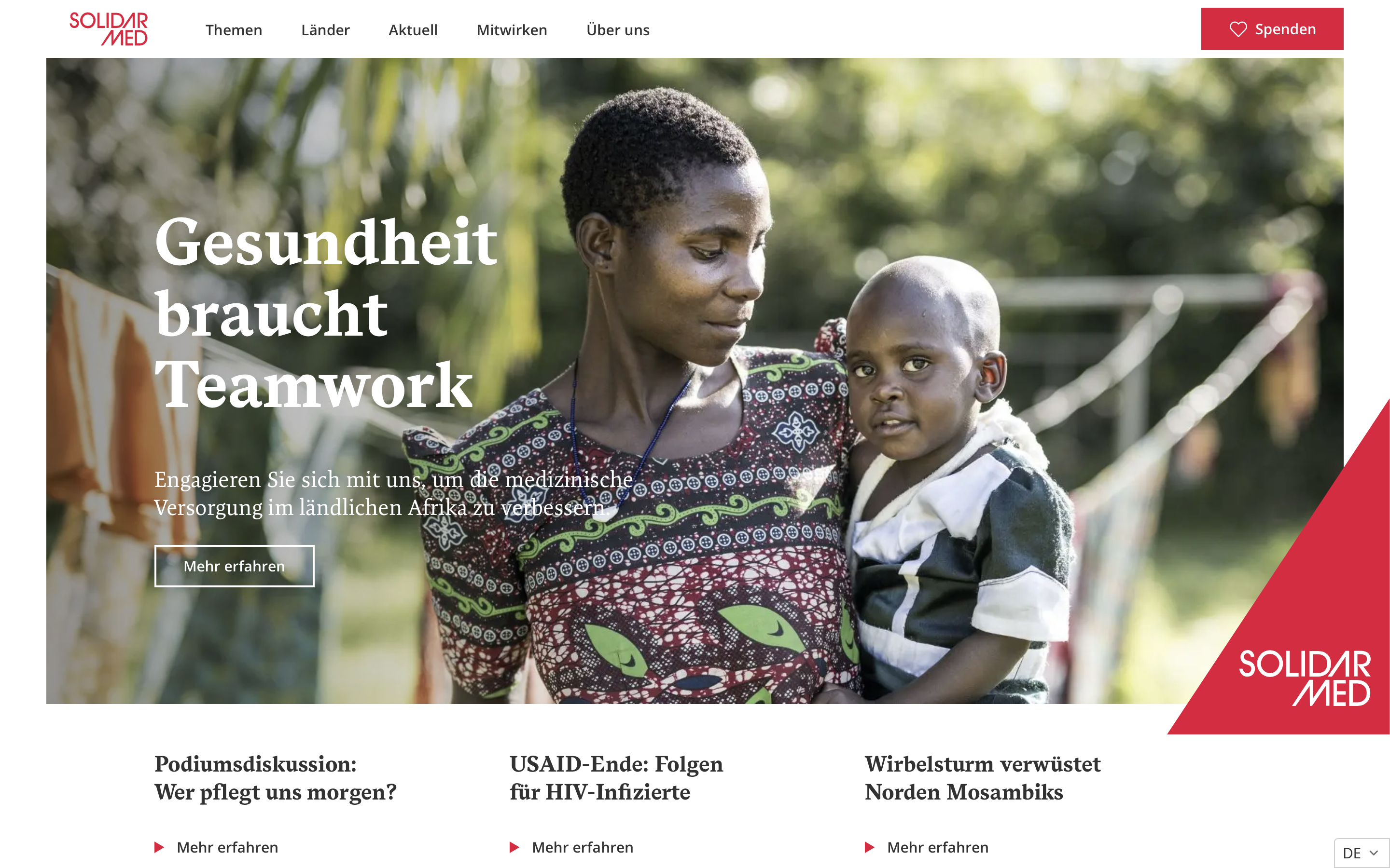
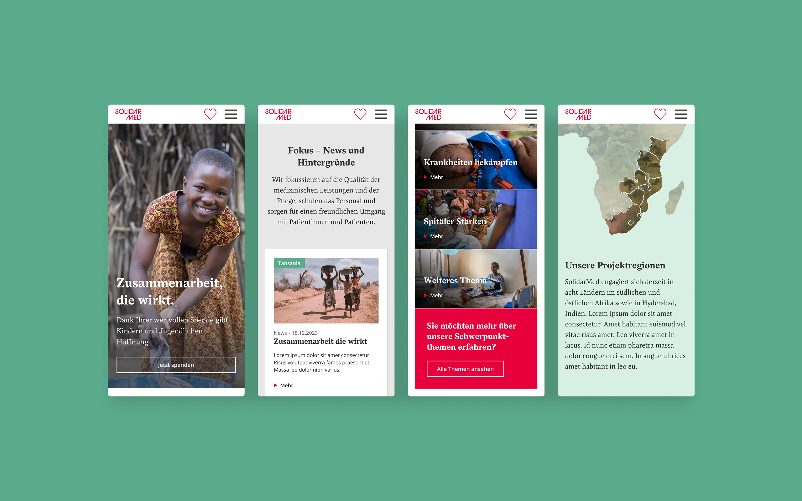
The result is a simplified, intuitive website that gives a clear view of Solidarmed’s work and impact. The new navigation allows users to explore by project, country, or topic without confusion.
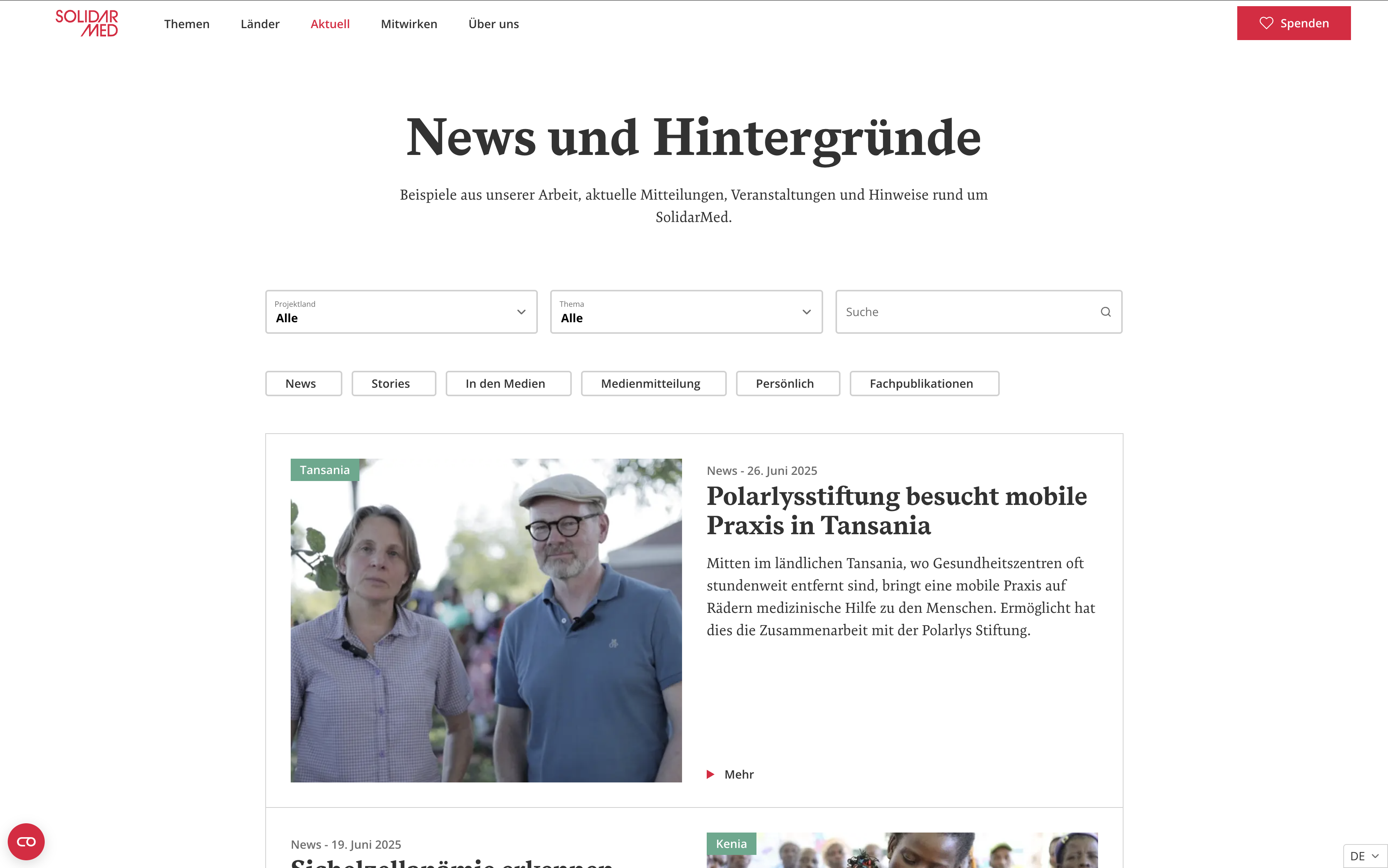
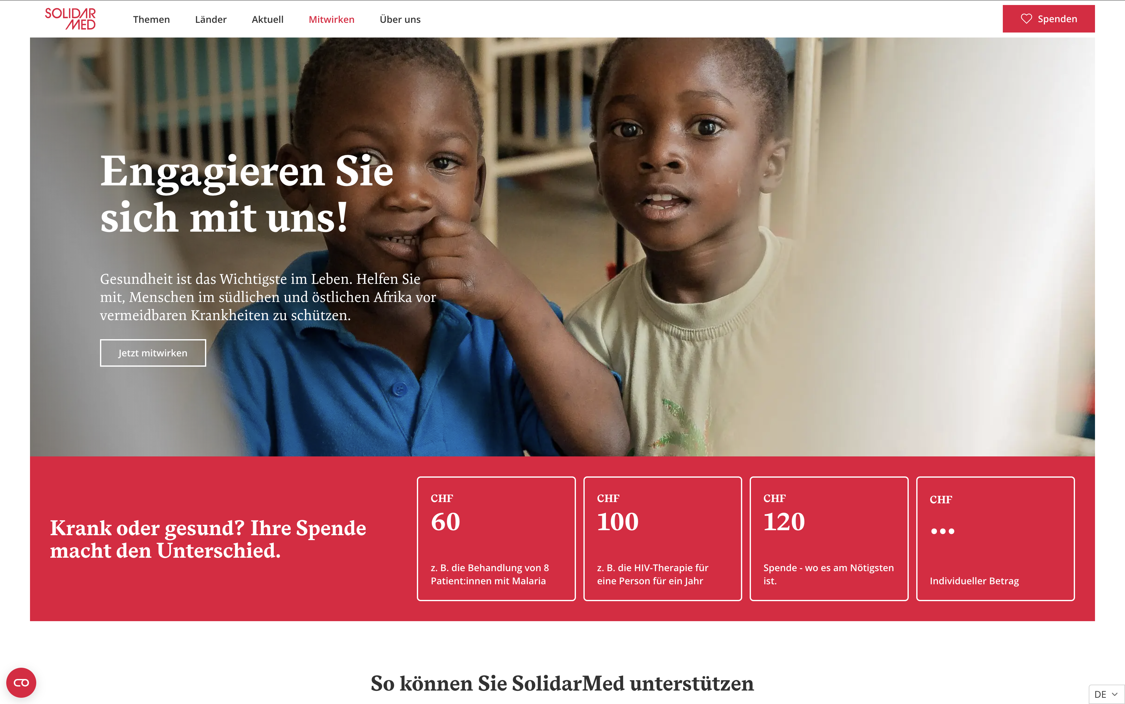
The donation process is now faster and more prominent, with CTAs placed strategically along relevant content. A new news & blog section allows users to browse and filter updates easily – encouraging transparency and ongoing engagement.
Content editors benefit from a modular system that reduces complexity and increases consistency. The new design remains visually aligned with the original, but provides a clearer, more user-friendly experience that’s built to grow.
Reflection & Learnings
This project showed me how powerful a clear UX audit can be when paired with thoughtful design. I learned to turn abstract data into tangible design decisions and to work within brand boundaries while still improving and modernizing the interface.
It was rewarding to simplify such a complex site structure – for both users and editors – and to build a clean design system from scratch. Most of all, it reminded me how even small UX changes can lead to big impact when grounded in research and collaboration.
Take a look at the final result
View Website
← Back
SolidarMed
UX-Check & Redesign
Solidarmed’s site lacked navigation, used overloaded landing pages and scattered dozens of modules – burying their donation ask. We ran a full UX audit (analytics, heatmaps, recordings), redefined personas, built a new information architecture, optimized modules and delivered a mini design system – without rebranding their existing look.
Starting point
The site came from another agency and shipped without a design system or clear nav. All content lived behind two homepage‑style pages and a footer menu. Users couldn’t find projects or a clear donation path. The question: “Is our website truly driving our mission?”
Challenges & opportunities
Solidarmed’s existing site had grown haphazardly under a previous agency, leaving it with no navigation structure, over 60 inconsistent content modules, and buried donation calls‑to‑action. This maze of content frustrated both visitors – who couldn’t easily find projects or donate – and editors, who struggled to maintain any sense of consistency. Yet these pain points were precisely our entry point for impact. By conducting a data‑driven UX audit and consolidating modules into a clear, purposeful set, we could transform confusion into clarity, make the donation path crystal‑clear, and enable the NGO’s stories and impact to shine through.
My Approach
As the sole UX/UI designer on the project, I led the entire redesign process – from the initial expert audit to the design of new modules. I worked closely with the client and our internal team to ensure a user-centered yet technically feasible solution.
- UX Audit & Data AnalysisWe started by reviewing the existing website through a comprehensive UX audit. This included an expert review, Google Analytics evaluation, and heatmap and session recording analysis using Hotjar. These methods helped us identify where users were struggling, which areas were being overlooked and why donation flows were underperforming.
- Persona Development & User FlowsWith the audit findings as a base, we refined and expanded the existing user personas. From there, we created tailored user flows for different types of visitors – such as donors, partners and people interested in field projects – to better match their needs and goals..
- Site Architecture & Content PlanningWe restructured the entire website to make the content easier to explore and understand. The new site map connected countries, projects and blog articles in a clear and flexible way. We also defined the page structure: what kind of content belonged on which pages, and how to sequence it for better comprehension and conversion.
- Module Design & SimplificationThe old site was built from too many inconsistent modules. We consolidated them into a streamlined, reusable system of flexible components that improved both the visual consistency and the content editing experience.
- Design System & HandoffSince there was no existing design system from the previous agency, I built a new one from scratch. It included spacing rules, type scales, color styles and UI components – ready for development handoff and future scalability.
Solution & Outcomes
The result is a simplified, intuitive website that gives a clear view of Solidarmed’s work and impact. The new navigation allows users to explore by project, country, or topic without confusion.
The donation process is now faster and more prominent, with CTAs placed strategically along relevant content. A new news & blog section allows users to browse and filter updates easily – encouraging transparency and ongoing engagement.
Content editors benefit from a modular system that reduces complexity and increases consistency. The new design remains visually aligned with the original, but provides a clearer, more user-friendly experience that’s built to grow.
Reflection & Learnings
This project showed me how powerful a clear UX audit can be when paired with thoughtful design. I learned to turn abstract data into tangible design decisions and to work within brand boundaries while still improving and modernizing the interface.
It was rewarding to simplify such a complex site structure – for both users and editors – and to build a clean design system from scratch. Most of all, it reminded me how even small UX changes can lead to big impact when grounded in research and collaboration.
Take a look at the final result
View Website