← Back
Zentrum Paul Klee & Kunstmuseum Bern
Website Relaunch
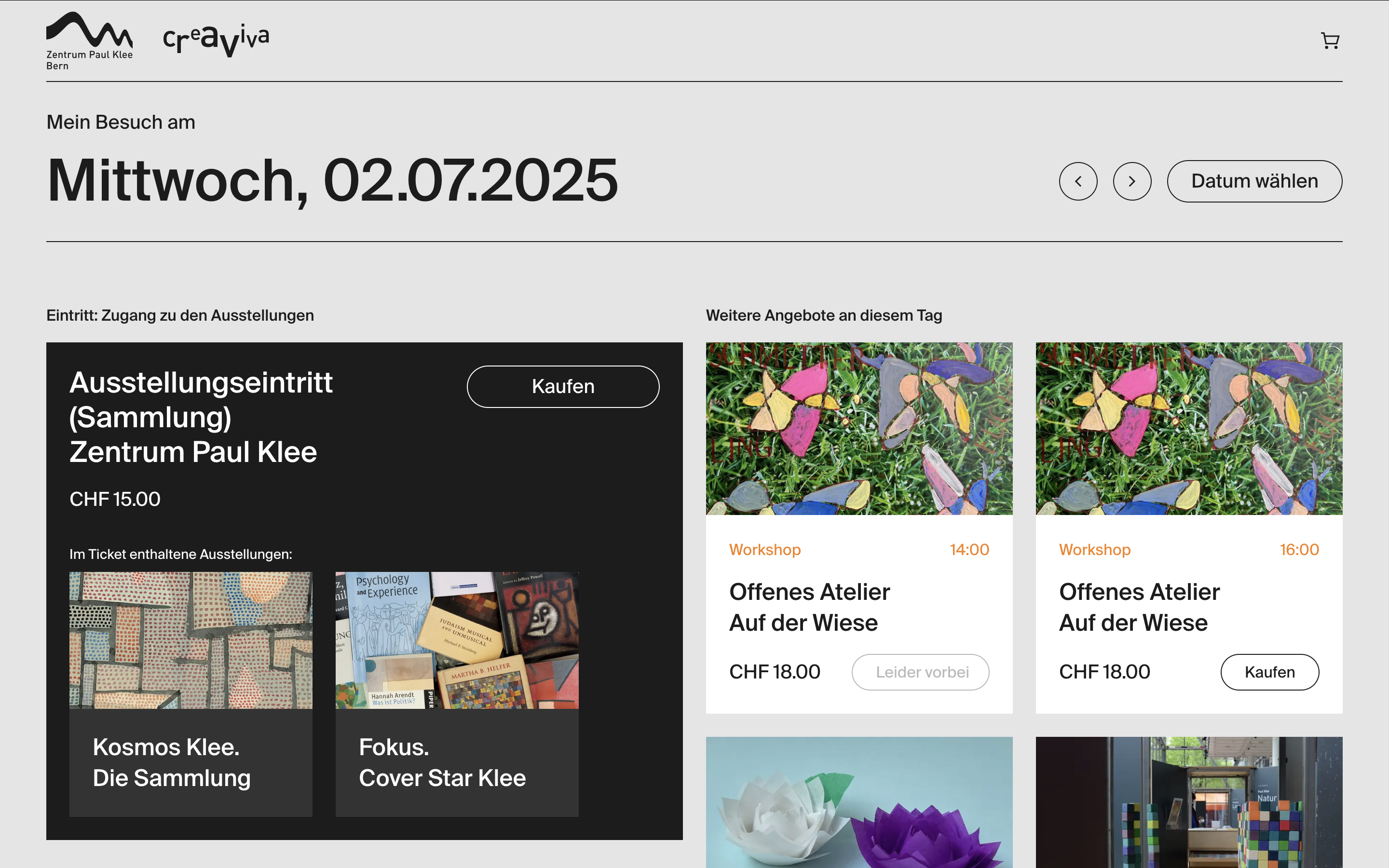
Three standalone museum sites made planning visits and buying tickets a chore. We built one shared, modular platform and a calendar‑based ticket shop so users can pick a date and see all exhibitions, tours, workshops and concerts across all three venues in one place. Within weeks, ticket sales doubled—and the CMS now supports over 25 editors from multiple departments.
Starting point
The client operated three separate websites, each with its own CMS and design. Visitors struggled to find what they needed: ticket pages were buried, navigation varied widely, and planning an outing across two or three institutions was almost impossible. Editors juggled dozens of disparate modules with no guidelines. The ask was clear: one platform to streamline both user journeys and content management.
Challenges & opportunities
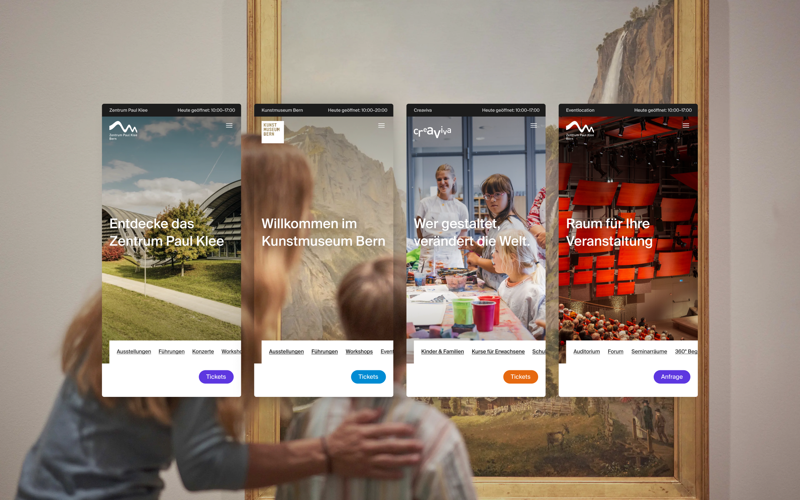
Bringing three distinct cultural brands onto one digital platform presented both design and organizational hurdles. Our first challenge was to create a cohesive user experience that respected each institution’s character, yet felt—and functioned—as a single, unified site. Technically, the project prioritized rapid development, so UX needed to earn its place and prove its value early on. On the content side, editors were overwhelmed by over 50 disparate page modules with no guidelines, making consistent, user‑focused pages nearly impossible. However, these challenges also presented a clear opportunity: by crafting a shared design system and lean module set, we could streamline editorial workflows, simplify visitor journeys, double ticket sales, and deliver an award‑winning user experience.
My Approach
As the lead UX/UI designer, I was responsible for the entire design process—from early research and concept to visual design, prototyping and handoff. I closely collaborated with the client, developers and internal team to ensure a smooth, user-centered process.
- Stakeholder & Discovery WorkshopsWe conducted workshops with all stakeholders to define goals, understand user needs, and set clear project scope. This created a solid foundation and alignment for the project.
- User Research & AnalysisWe developed target groups, personas, and customer journeys to map typical user experiences and expectations.
- Concept Development & Information ArchitectureBased on insights, we created a structured site concept and user flows that outlined key user scenarios and navigation paths.
- Wireframing & PrototypingI designed low-fidelity wireframes which we iterated with stakeholders. Interactive prototypes supported usability testing and design presentations.
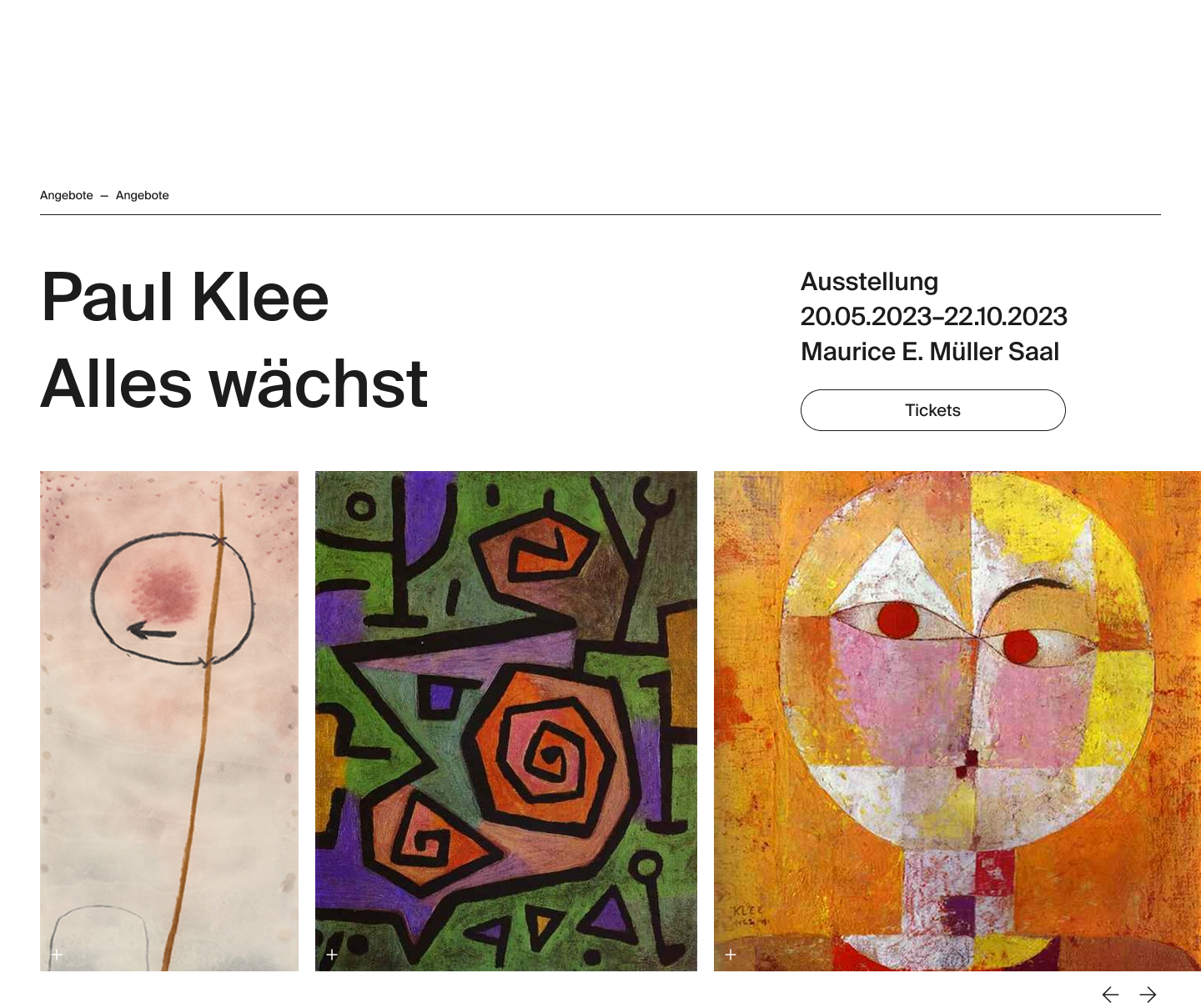
- Visual Design & Design System CreationIn parallel, I crafted a modular, responsive visual design aligned with the institutions’ identities. The Figma-based design system includes reusable components and a color scheme with distinct accents for each institution.
- Module Design & UX OptimizationI designed flexible, reusable modules, iterated continuously, and collaborated closely with clients and developers to ensure usability and consistency.
- Quality Assurance & HandoverI delivered a final clickable prototype, supported QA, and handed over all design assets and documentation to development.
- Post-Launch Support & TrainingAfter launch, I trained editorial teams and created guidelines to enable user-friendly content creation and ongoing platform growth.
Solution & Outcomes
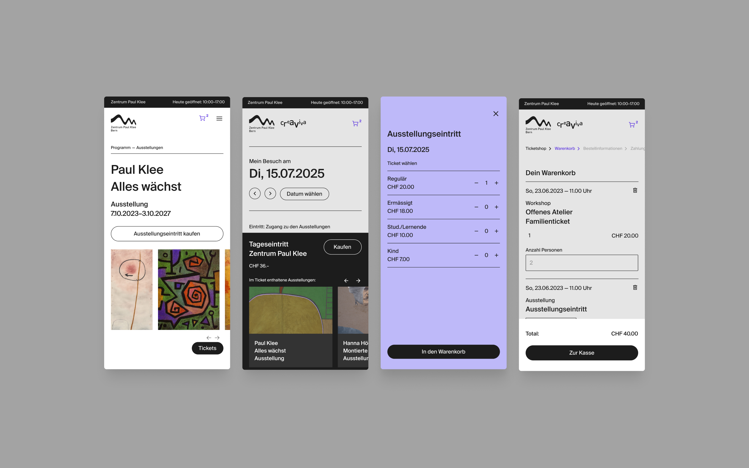
We developed a modular digital platform that brings together multiple institutions, programs and offerings under one unified experience. The new website allows visitors to explore everything happening at Zentrum Paul Klee – from exhibitions and concerts to outdoor activities and educational workshops – all in one place.
One of the key features is the smart ticketing system, which helps users discover and book multiple activities in a single session. Instead of showing isolated events, the system suggests additional activities on the same day – like guided tours, readings or evening concerts – encouraging both spontaneous planning and cross-selling.
Design-wise, I created a minimal yet flexible interface with lots of white space and clean lines. Each institution is subtly highlighted through its own accent color, while the overall look remains timeless and neutral. Since no existing corporate design was available, this new UI also serves as a foundation for future branding efforts.
Despite the project's technical and CMS-first focus, the final product delivered a highly intuitive and award-winning user experience. The editorial backend is now so easy to use that 25+ editors across departments can manage content smoothly without training.
And best of all: Ticket sales doubled within the first weeks after launch – proving the new design not only works, but converts.
Reflection & Learnings
This project taught me how to navigate a dev-driven setup while staying true to UX goals. I learned to build a flexible design system that works across multiple brands and use cases, and to guide complex decisions with clarity.
It was rewarding to co-create smart, user-friendly solutions with the team and client, and to see them come to life in a system used daily by both visitors and editors. Even more fulfilling: the resulting user experience was recognized with design awards – a great validation of our shared efforts.
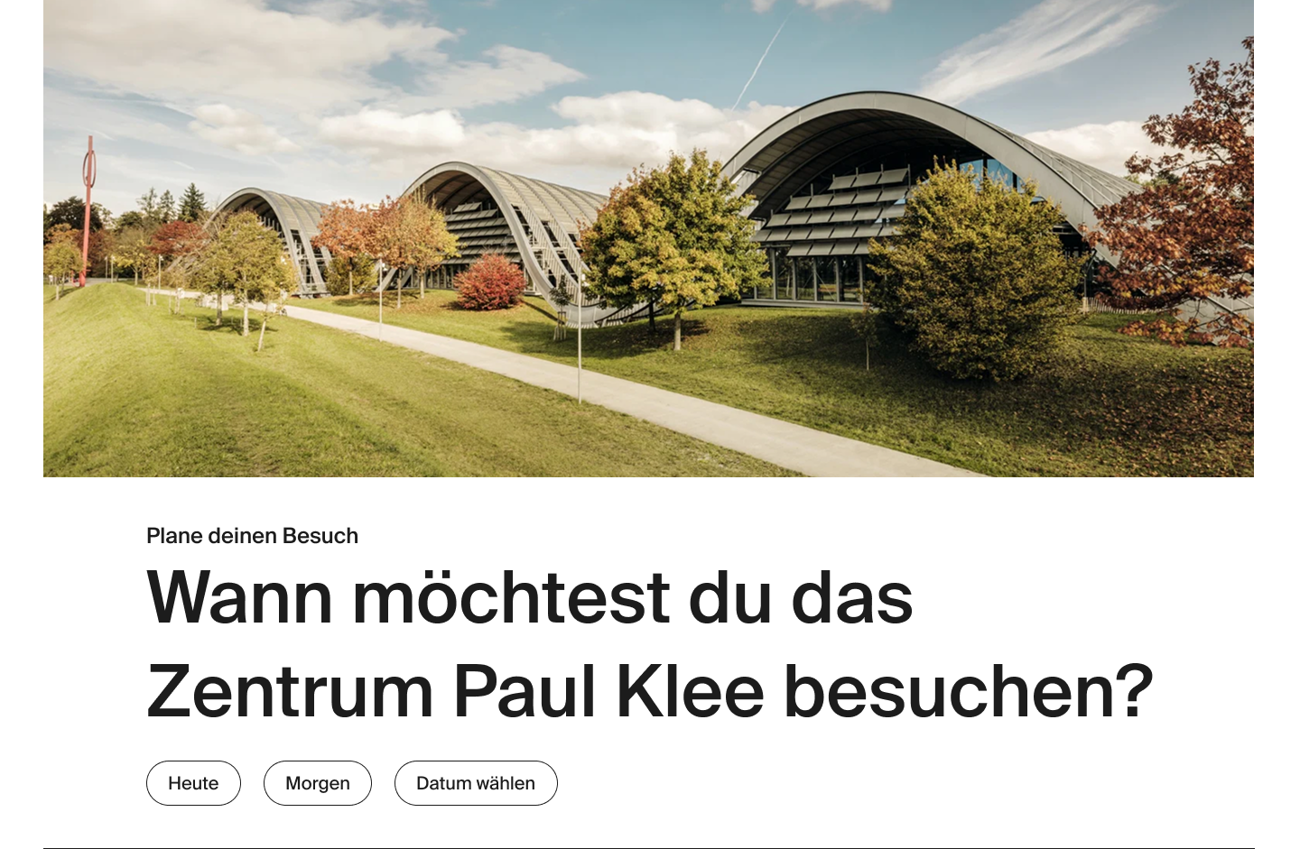
Take a look at the final result
View Website
← Back
Zentrum Paul Klee & Kunstmuseum Bern
Website Relaunch
Three standalone museum sites made planning visits and buying tickets a chore. We built one shared, modular platform and a calendar‑based ticket shop so users can pick a date and see all exhibitions, tours, workshops and concerts across all three venues in one place. Within weeks, ticket sales doubled—and the CMS now supports over 25 editors from multiple departments.


Starting point
The client operated three separate websites, each with its own CMS and design. Visitors struggled to find what they needed: ticket pages were buried, navigation varied widely, and planning an outing across two or three institutions was almost impossible. Editors juggled dozens of disparate modules with no guidelines. The ask was clear: one platform to streamline both user journeys and content management.
Challenges & opportunities
Bringing three distinct cultural brands onto one digital platform presented both design and organizational hurdles. Our first challenge was to create a cohesive user experience that respected each institution’s character, yet felt—and functioned—as a single, unified site. Technically, the project prioritized rapid development, so UX needed to earn its place and prove its value early on. On the content side, editors were overwhelmed by over 50 disparate page modules with no guidelines, making consistent, user‑focused pages nearly impossible. However, these challenges also presented a clear opportunity: by crafting a shared design system and lean module set, we could streamline editorial workflows, simplify visitor journeys, double ticket sales, and deliver an award‑winning user experience.
My Approach
As the lead UX/UI designer, I was responsible for the entire design process—from early research and concept to visual design, prototyping and handoff. I closely collaborated with the client, developers and internal team to ensure a smooth, user-centered process.
- Stakeholder & Discovery WorkshopsWe conducted workshops with all stakeholders to define goals, understand user needs, and set clear project scope. This created a solid foundation and alignment for the project.
- User Research & AnalysisWe developed target groups, personas, and customer journeys to map typical user experiences and expectations.
- Concept Development & Information ArchitectureBased on insights, we created a structured site concept and user flows that outlined key user scenarios and navigation paths.
- Wireframing & PrototypingI designed low-fidelity wireframes which we iterated with stakeholders. Interactive prototypes supported usability testing and design presentations.
- Visual Design & Design System CreationIn parallel, I crafted a modular, responsive visual design aligned with the institutions’ identities. The Figma-based design system includes reusable components and a color scheme with distinct accents for each institution.
- Module Design & UX OptimizationI designed flexible, reusable modules, iterated continuously, and collaborated closely with clients and developers to ensure usability and consistency.
- Quality Assurance & HandoverI delivered a final clickable prototype, supported QA, and handed over all design assets and documentation to development.
- Post-Launch Support & TrainingAfter launch, I trained editorial teams and created guidelines to enable user-friendly content creation and ongoing platform growth.

Solution & Outcomes
We developed a modular digital platform that brings together multiple institutions, programs and offerings under one unified experience. The new website allows visitors to explore everything happening at Zentrum Paul Klee – from exhibitions and concerts to outdoor activities and educational workshops – all in one place.
One of the key features is the smart ticketing system, which helps users discover and book multiple activities in a single session. Instead of showing isolated events, the system suggests additional activities on the same day – like guided tours, readings or evening concerts – encouraging both spontaneous planning and cross-selling.
Design-wise, I created a minimal yet flexible interface with lots of white space and clean lines. Each institution is subtly highlighted through its own accent color, while the overall look remains timeless and neutral. Since no existing corporate design was available, this new UI also serves as a foundation for future branding efforts.
Despite the project's technical and CMS-first focus, the final product delivered a highly intuitive and award-winning user experience. The editorial backend is now so easy to use that 25+ editors across departments can manage content smoothly without training.
And best of all: Ticket sales doubled within the first weeks after launch – proving the new design not only works, but converts.
Reflection & Learnings
This project taught me how to navigate a dev-driven setup while staying true to UX goals. I learned to build a flexible design system that works across multiple brands and use cases, and to guide complex decisions with clarity.
It was rewarding to co-create smart, user-friendly solutions with the team and client, and to see them come to life in a system used daily by both visitors and editors. Even more fulfilling: the resulting user experience was recognized with design awards – a great validation of our shared efforts.
Take a look at the final result
View Website
← Back
Zentrum Paul Klee & Kunstmuseum Bern
Website Relaunch
Three standalone museum sites made planning visits and buying tickets a chore. We built one shared, modular platform and a calendar‑based ticket shop so users can pick a date and see all exhibitions, tours, workshops and concerts across all three venues in one place. Within weeks, ticket sales doubled—and the CMS now supports over 25 editors from multiple departments.


Starting point
The client operated three separate websites, each with its own CMS and design. Visitors struggled to find what they needed: ticket pages were buried, navigation varied widely, and planning an outing across two or three institutions was almost impossible. Editors juggled dozens of disparate modules with no guidelines. The ask was clear: one platform to streamline both user journeys and content management.
Challenges & opportunities
Bringing three distinct cultural brands onto one digital platform presented both design and organizational hurdles. Our first challenge was to create a cohesive user experience that respected each institution’s character, yet felt—and functioned—as a single, unified site. Technically, the project prioritized rapid development, so UX needed to earn its place and prove its value early on. On the content side, editors were overwhelmed by over 50 disparate page modules with no guidelines, making consistent, user‑focused pages nearly impossible. However, these challenges also presented a clear opportunity: by crafting a shared design system and lean module set, we could streamline editorial workflows, simplify visitor journeys, double ticket sales, and deliver an award‑winning user experience.
My Approach
As the lead UX/UI designer, I was responsible for the entire design process—from early research and concept to visual design, prototyping and handoff. I closely collaborated with the client, developers and internal team to ensure a smooth, user-centered process.
- Stakeholder & Discovery WorkshopsWe conducted workshops with all stakeholders to define goals, understand user needs, and set clear project scope. This created a solid foundation and alignment for the project.
- User Research & AnalysisWe developed target groups, personas, and customer journeys to map typical user experiences and expectations.
- Concept Development & Information ArchitectureBased on insights, we created a structured site concept and user flows that outlined key user scenarios and navigation paths.
- Wireframing & PrototypingI designed low-fidelity wireframes which we iterated with stakeholders. Interactive prototypes supported usability testing and design presentations.
- Visual Design & Design System CreationIn parallel, I crafted a modular, responsive visual design aligned with the institutions’ identities. The Figma-based design system includes reusable components and a color scheme with distinct accents for each institution.
- Module Design & UX OptimizationI designed flexible, reusable modules, iterated continuously, and collaborated closely with clients and developers to ensure usability and consistency.
- Quality Assurance & HandoverI delivered a final clickable prototype, supported QA, and handed over all design assets and documentation to development.
- Post-Launch Support & TrainingAfter launch, I trained editorial teams and created guidelines to enable user-friendly content creation and ongoing platform growth.

Solution & Outcomes
We developed a modular digital platform that brings together multiple institutions, programs and offerings under one unified experience. The new website allows visitors to explore everything happening at Zentrum Paul Klee – from exhibitions and concerts to outdoor activities and educational workshops – all in one place.
One of the key features is the smart ticketing system, which helps users discover and book multiple activities in a single session. Instead of showing isolated events, the system suggests additional activities on the same day – like guided tours, readings or evening concerts – encouraging both spontaneous planning and cross-selling.
Design-wise, I created a minimal yet flexible interface with lots of white space and clean lines. Each institution is subtly highlighted through its own accent color, while the overall look remains timeless and neutral. Since no existing corporate design was available, this new UI also serves as a foundation for future branding efforts.
Despite the project's technical and CMS-first focus, the final product delivered a highly intuitive and award-winning user experience. The editorial backend is now so easy to use that 25+ editors across departments can manage content smoothly without training.
And best of all: Ticket sales doubled within the first weeks after launch – proving the new design not only works, but converts.
Reflection & Learnings
This project taught me how to navigate a dev-driven setup while staying true to UX goals. I learned to build a flexible design system that works across multiple brands and use cases, and to guide complex decisions with clarity.
It was rewarding to co-create smart, user-friendly solutions with the team and client, and to see them come to life in a system used daily by both visitors and editors. Even more fulfilling: the resulting user experience was recognized with design awards – a great validation of our shared efforts.

Take a look at the final result
View Website
← Back
Zentrum Paul Klee & Kunstmuseum Bern
Website Relaunch
Three standalone museum sites made planning visits and buying tickets a chore. We built one shared, modular platform and a calendar‑based ticket shop so users can pick a date and see all exhibitions, tours, workshops and concerts across all three venues in one place. Within weeks, ticket sales doubled—and the CMS now supports over 25 editors from multiple departments.


Starting point
The client operated three separate websites, each with its own CMS and design. Visitors struggled to find what they needed: ticket pages were buried, navigation varied widely, and planning an outing across two or three institutions was almost impossible. Editors juggled dozens of disparate modules with no guidelines. The ask was clear: one platform to streamline both user journeys and content management.
Challenges & opportunities
Bringing three distinct cultural brands onto one digital platform presented both design and organizational hurdles. Our first challenge was to create a cohesive user experience that respected each institution’s character, yet felt—and functioned—as a single, unified site. Technically, the project prioritized rapid development, so UX needed to earn its place and prove its value early on. On the content side, editors were overwhelmed by over 50 disparate page modules with no guidelines, making consistent, user‑focused pages nearly impossible. However, these challenges also presented a clear opportunity: by crafting a shared design system and lean module set, we could streamline editorial workflows, simplify visitor journeys, double ticket sales, and deliver an award‑winning user experience.
My Approach
As the lead UX/UI designer, I was responsible for the entire design process—from early research and concept to visual design, prototyping and handoff. I closely collaborated with the client, developers and internal team to ensure a smooth, user-centered process.
- Stakeholder & Discovery WorkshopsWe conducted workshops with all stakeholders to define goals, understand user needs, and set clear project scope. This created a solid foundation and alignment for the project.
- User Research & AnalysisWe developed target groups, personas, and customer journeys to map typical user experiences and expectations.
- Concept Development & Information ArchitectureBased on insights, we created a structured site concept and user flows that outlined key user scenarios and navigation paths.
- Wireframing & PrototypingI designed low-fidelity wireframes which we iterated with stakeholders. Interactive prototypes supported usability testing and design presentations.
- Visual Design & Design System CreationIn parallel, I crafted a modular, responsive visual design aligned with the institutions’ identities. The Figma-based design system includes reusable components and a color scheme with distinct accents for each institution.
- Module Design & UX OptimizationI designed flexible, reusable modules, iterated continuously, and collaborated closely with clients and developers to ensure usability and consistency.
- Quality Assurance & HandoverI delivered a final clickable prototype, supported QA, and handed over all design assets and documentation to development.
- Post-Launch Support & TrainingAfter launch, I trained editorial teams and created guidelines to enable user-friendly content creation and ongoing platform growth.

Solution & Outcomes
We developed a modular digital platform that brings together multiple institutions, programs and offerings under one unified experience. The new website allows visitors to explore everything happening at Zentrum Paul Klee – from exhibitions and concerts to outdoor activities and educational workshops – all in one place.
One of the key features is the smart ticketing system, which helps users discover and book multiple activities in a single session. Instead of showing isolated events, the system suggests additional activities on the same day – like guided tours, readings or evening concerts – encouraging both spontaneous planning and cross-selling.
Design-wise, I created a minimal yet flexible interface with lots of white space and clean lines. Each institution is subtly highlighted through its own accent color, while the overall look remains timeless and neutral. Since no existing corporate design was available, this new UI also serves as a foundation for future branding efforts.
Despite the project's technical and CMS-first focus, the final product delivered a highly intuitive and award-winning user experience. The editorial backend is now so easy to use that 25+ editors across departments can manage content smoothly without training.
And best of all: Ticket sales doubled within the first weeks after launch – proving the new design not only works, but converts.
Reflection & Learnings
This project taught me how to navigate a dev-driven setup while staying true to UX goals. I learned to build a flexible design system that works across multiple brands and use cases, and to guide complex decisions with clarity.
It was rewarding to co-create smart, user-friendly solutions with the team and client, and to see them come to life in a system used daily by both visitors and editors. Even more fulfilling: the resulting user experience was recognized with design awards – a great validation of our shared efforts.

Take a look at the final result
View Website